


RELATIONSHIP MANAGER
🖥️ Desktop | 📱 Mobile
🎯 The objective of this project was to help users manage their personal and professional relationships more effectively within the phone app. Many users rely on memory or external tools to track follow-ups and maintain connections, leading to missed opportunities. Research showed that 73% of our users analyze customer data daily.
Because this was a new feature in our phone product, early designs needed to balance automation and user control. My role was to define the PRM experience, ensuring it seamlessly integrated with existing workflows while being non-intrusive and intuitive.
The Relationship Manager began as an idea developed with interns to help support small businesses that don't have CRMs.
The Design Journey
1. DISCOVER
Researched info management and evaluated CRM tools and smart contact apps.
2. ITERATE
Designed and tested different reminder and tagging models to ensure usability and relevance.
3. FEEDBACK
Conducted user tests & surveys to identify concerns with privacy, common needs, and framework clarity.
4. IMPROVE
Refined the feature to improve adoption by enhancing user control.
DISCOVERY
Pain points
👎 Users often struggled with staying connected because:
Challenge 1: Important follow-ups were forgotten due to lack of reminders.
Challenge 2: Call and message history lacked contextual insights, requiring manual tracking.
Challenge 3: Existing CRM tools were too complex for personal use.
DISCOVERY
Design goals
👍 To address these pain points, we focused on:
Goal 1: Providing smart, timely follow-up reminders based on call frequency and user-defined priorities.
Goal 2: Allowing users to add quick notes and tags to contacts for better context.
Goal 3: Ensuring a lightweight, seamless integration without overwhelming notifications.

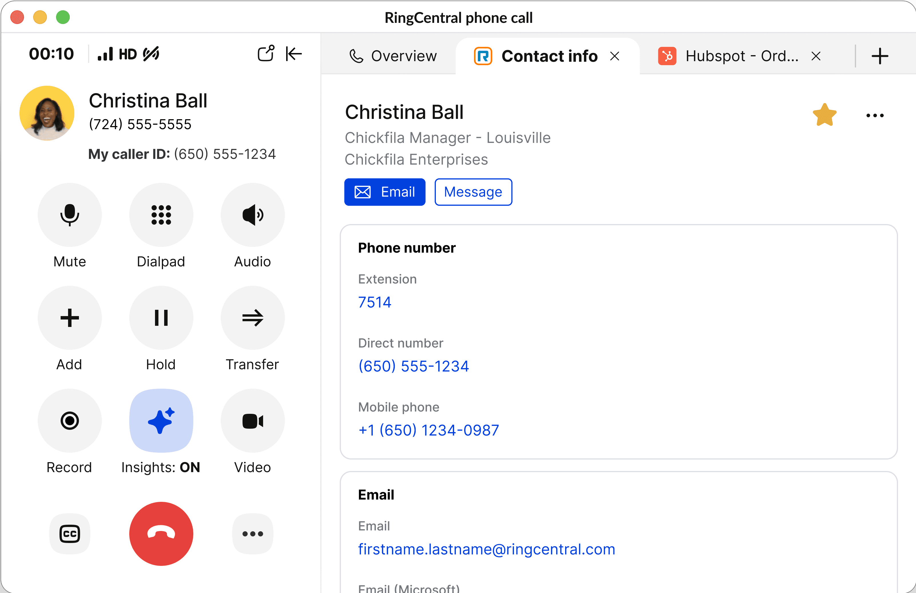
Iteration 1 follows existing framework for phone pop

Iteration 2 explores adding contact info on new RC profile dashboard

Iteration 3 resulted from users requesting focused tabs for external info sources.
ITERATION
Framework
I explored the formatting and hierarchy for the panel and received feedback from larger team. in critique on legibility. In the final design, I added more whitespace, dividers to separate shortcuts, and grouped them into clear categories.
prototype
FEEDBACK
Research
Surveys and sorting allowed us to analyze adoption rates. We addressed common pain paints and increased adoption by 15%.
data
IMPROVEMENTS
Final thoughts
Impact:
🎉 60% of users engaged with PRM features within the first two weeks
📈 Follow-up completion rates increased by 25% among power users
💡 Future iterations will explore integration with calendar events and messaging insights
As our product evolves, I’ll continue refining the PRM feature to improve its usability, personalization, and privacy settings, ensuring it meets user needs without being intrusive. We will also collaborate with marketing to develop a clearer onboarding strategy for new users.
💛 Team shoutouts
Last updated March 2025